Transparent Sticky Navigation in WordPress: How We Built It
First impressions matter. The moment a visitor lands on your homepage, three things compete for attention: your headline, your hero image, and — often getting in the way of both — your navigation bar. We just shipped a navigation update to our Nynaeve WordPress theme that solves this tension cleanly: the nav starts transparent, then glides to a solid background as the user scrolls. It also detects which design blocks are on the page and adjusts its colour automatically. Here is what changed, why it matters, and — for developers — how it works under the hood.
Part 1 — For Business Owners
The problem with a solid navigation bar on hero pages
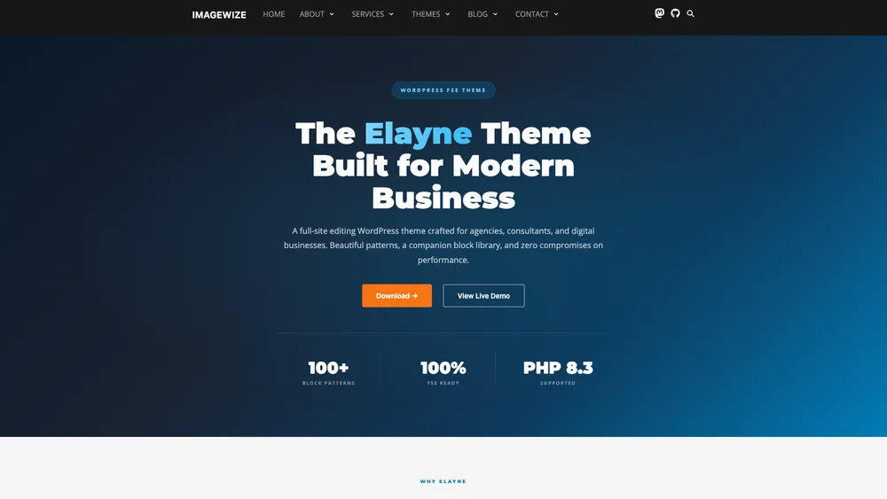
Most WordPress themes render the navigation bar with a solid background colour at all times. That is fine on pages where the first section is plain white content. But on pages built with a full-width hero — a large image, a dark gradient, a bold headline — a solid nav bar creates a visual break right at the top of the page. It cuts off the hero before the visitor has even seen it.
What changed
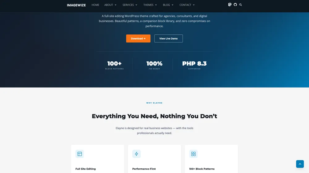
The navigation on Imagewize-built sites now starts fully transparent on pages where the first section is a dark hero block. The site logo and menu links float cleanly over the hero design. Once the visitor scrolls past roughly 80 pixels — enough to clear the hero — the navigation background fades in smoothly: a semi-transparent dark grey that keeps links legible against any content below.
The effect is subtle and intentional. Visitors rarely notice it consciously. What they do notice is that the page feels polished and uncluttered on load.
Why it matters for your business
- First impression: a hero-first layout with a transparent nav signals a professionally designed site, not an off-the-shelf template — the kind of detail visitors associate with established, trustworthy businesses.
- More of the hero stays visible: the headline and call-to-action that you paid a designer to craft are no longer cropped by a heavy nav bar on load.
- No extra plugins: the feature is baked into the theme — nothing to install, update, pay a subscription for, or worry about breaking after a WordPress core update.
- Works automatically: the navigation detects the page layout and enables the effect only where it makes sense — pages with standard layouts keep the normal solid header, no manual toggles per page.
- Faster than a plugin: shipping this in theme code instead of a third-party plugin keeps the page lean — no extra HTTP request, no plugin dashboard clutter, nothing that could conflict with future plugins.
Part 3 — For Business Owners & Designers
Here the before views and after views using screenshots. You can click them to see the larger version in a new tab.
before

After
Part 3 — For Developers
The plan
The goal was a navigation bar that:
- Stays fully transparent when the first content block is one of our dark hero variants
- Transitions to a semi-transparent dark background after 80px of scroll
- Stays solid on pages that do not start with a dark hero
- Works correctly with WordPress’s admin bar and mobile dropdown menus
Three files changed: resources/css/app.css, resources/js/app.js, and indirectly resources/views/sections/header.blade.php (the header template already used .banner as its class — no change needed there).
The CSS overflow-x gotcha
Before anything else, we had to fix a layout bug that was silently preventing position: sticky from working.
The site already had overflow-x: hidden on html and body to prevent the Slick carousel from creating a horizontal scrollbar. The problem: overflow-x: hidden creates a scroll container, and any position: sticky element inside a scroll container stops sticking — it scrolls away with the content.
The fix is a single keyword change:
html,
body {
  max-width: 100%;
  overflow-x: clip; /* not hidden — clip does not create a scroll container */
}
overflow-x: clip cuts off overflow at the element boundary without establishing a new scroll container. position: sticky on the header now works as expected. This is the kind of subtle CSS behaviour that costs an hour of debugging the first time you encounter it.
Making the nav sticky
With the scroll container issue resolved, position: sticky on the .banner element is straightforward:
.banner {
  position: sticky;
  top: 0;
  z-index: 50;
  background: #171717;
  transition: background 0.3s ease, box-shadow 0.3s ease;
}
The transition property means any background change — from transparent to semi-transparent, or vice versa — animates over 300ms instead of snapping.
Detecting the first block with JavaScript
The transparent effect should only activate on pages where a dark hero block is genuinely the first thing a visitor sees. We maintain an explicit allowlist of block class names:
const transparentNavBlocks = [
  'wp-block-imagewize-elayne-hero',
  'wp-block-imagewize-service-hero',
  'wp-block-nynaeve-contact-section',
];
Finding the first block requires two selectors. Some pages wrap content in .wp-block-post-content (pages with a separate page header block); others render blocks as direct children of #main. We check both:
let firstBlock =
  document.querySelector('#main .wp-block-post-content > *:first-child') ||
  document.querySelector('#main > *:first-child');
WordPress also frequently wraps blocks in a core/group container. If the first block is a wrapper that is not on the allowlist, we look one level deeper before giving up:
if (!matchesAllowlist(firstBlock)) {
  const nested = firstBlock.querySelector(':scope > *:first-child');
  if (nested && matchesAllowlist(nested)) firstBlock = nested;
}
If no allowlisted block is found at either level, the function returns early and the nav keeps its standard solid background. No classes are added, nothing changes.
Toggling state with two CSS classes
When an allowlisted block is found, we add .has-dark-hero to the .banner element. A passive scroll listener then toggles .is-scrolled based on the 80px threshold:
header.classList.add('has-dark-hero');

const SCROLL_THRESHOLD = 80;
const updateNav = () => {
  header.classList.toggle('is-scrolled', window.scrollY > SCROLL_THRESHOLD);
};

window.addEventListener('scroll', updateNav, { passive: true });
updateNav(); // run once on load in case page is already scrolled
The corresponding CSS:
/* Transparent at page-top */
.banner.has-dark-hero {
  background: transparent;
}

/* Semi-transparent dark once scrolled */
.banner.has-dark-hero.is-scrolled {
  background: rgba(23, 23, 23, 0.9);
  box-shadow: 0 1px 0 rgba(255, 255, 255, 0.06);
}
The ::before pseudo-element handles one more edge case: on hero pages we want a subtle dark tint behind the nav itself (so logo and links stay legible against bright hero imagery), but we do not want that tint to bleed into the rest of the page body. Using a pseudo-element scoped to .banner.has-dark-hero isolates the overlay to the nav element only:
.banner.has-dark-hero::before {
  content: '';
  position: absolute;
  inset: 0;
  background: #0d1822;
  z-index: -1;
  pointer-events: none;
}
Mobile and admin bar edge cases
Two more rules round out the implementation.
On mobile, the nav dropdown opens below the header and needs a solid background regardless of the hero state — a transparent dropdown over a hero image is unreadable:
@media (max-width: 1023px) {
  .banner.has-dark-hero #menu {
    background: #171717;
  }
}
When WordPress’s admin bar is visible (logged-in users on desktop), the sticky header needs to sit below the 32px admin bar rather than at the viewport top:
.admin-bar .banner {
  top: 32px;
}

/* WordPress hides admin bar below 782px — reset to avoid gaps */
@media screen and (max-width: 782px) {
  .banner {
    top: 0 !important;
  }
}
Summary
The full implementation is around 120 lines across two files. The interesting parts are not the scroll listener — that is a standard pattern — but the CSS clip vs hidden distinction that makes sticky work, the two-level block detection that handles real WordPress DOM structure, and the pseudo-element approach that isolates the nav overlay from the page background. All of it ships as theme code with no JavaScript dependencies beyond what the theme already bundles.
Want this on your WordPress site?
This feature ships in Nynaeve v2.13.0 and is live on every site we build and maintain. If you run an SME with a WordPress site where the navigation feels dated or visually heavy on the homepage, this is exactly the kind of polish that pushes a site from “fine” to “professional” — and we ship details like this as part of every WordPress engagement we take on.
Need Help with a Sage or WordPress Project?
We work with agencies and freelance developers on Sage theme builds, WordPress migrations, and white-label development. Whether you need hands-on help or just a second opinion on architecture, we’re available for short-term and ongoing engagements.
- Sage 10 / 11 theme builds and migrations
- Composer, Vite, and build process troubleshooting
- White-label WordPress development for agencies
- Code reviews and technical consulting