WooCommerce Shop Filters on a Block Theme: How We Built the Category View and Filter Drawer
This is part two of our Elayne WooCommerce store build series. Part one covered the product page — gallery, colour swatches, sticky mobile ATC bar. This post covers the shop listing view: the category archive page, the filter sidebar, and the filter drawer on mobile. It took two days and about 38 commits. Here is what we built and what we had to solve to get there.
For Store Owners: What This Gives Your Customers
When a customer lands on your shop or a product category page, they should be able to narrow down your range quickly — by colour, style, price, or any product feature you sell. Without that, they scroll through everything or leave. The work in this post is about making that filtering experience feel as polished as a dedicated e-commerce platform, built entirely on WordPress and WooCommerce — no platform lock-in, no monthly subscription cut.
What Your Customers See
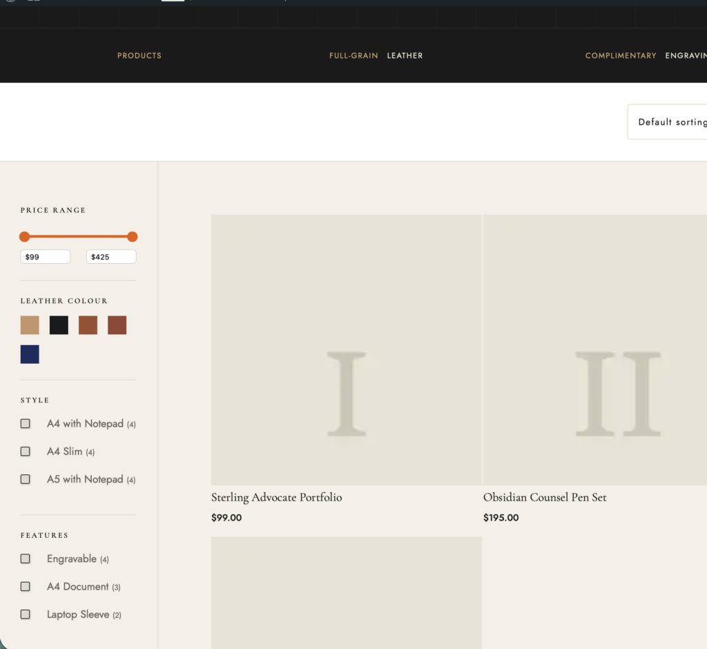
- Category hero section: Each product category gets its own dynamic hero — category name, description, and product count pulled automatically from WooCommerce, no manual editing required when you add or rename categories
- Filter sidebar on desktop: Sticky sidebar with price range slider, colour swatches, style checkboxes, and feature filters — all visible at once, all working in parallel
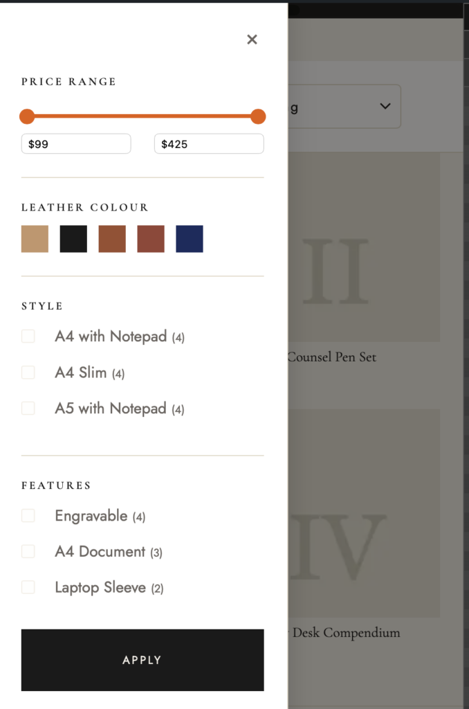
- Filter drawer on mobile: A slide-in drawer triggered by a “Filters” button in the toolbar, identical filter options but optimised for touch — no layout squeeze, no overlapping elements
- Active filter display: When a filter is active, a tag appears at the top of the results showing what is applied, with a one-click remove. A “Clear all filters” button removes everything at once
- Colour swatch filters: Instead of text labels, leather colour variants show as actual colour patches — tap to select, orange border on active state, hover maintains the colour (this one took more work than expected)
- Product count per filter: Each checkbox filter shows how many products match, so customers are never surprised by an empty result
Why This Matters for Your Business
Filtering is the difference between a customer who finds the right product in 30 seconds and one who gives up and goes to a competitor. The pattern we built is not specific to leather accessories — the same system works for clothing, cosmetics, homeware, tools, or any WooCommerce store with product variations. The colour swatches, checkboxes, and price range are driven by your product attributes, so they adapt to whatever you sell.
The mobile drawer matters because the majority of e-commerce traffic is on phones. A filter experience that works well on desktop but breaks or feels awkward on mobile costs you sales. We spent significant time on the mobile drawer specifically because of a subtle technical issue (described below in the developer section) that made it behave incorrectly on first tap.
Working with us: A WooCommerce store setup on the Elayne block theme — including the shop, category, and product pages — typically runs 15–25 hours depending on product count and customisation depth. Rate: €65/hour. Get in touch to discuss your project.
For Agencies and Developers: How We Built It
The following covers the technical implementation — the template structure, the JavaScript filter drawer, the CSS challenges with WooCommerce filter blocks in a block theme context, and the specific bugs we had to solve. If you are building a similar system or integrating WooCommerce filtering into a custom block theme, this is the part that will save you time.
The Template Architecture
WooCommerce uses two separate archive templates in block themes: archive-product.html for the main shop page, and taxonomy-product_cat.html for individual category pages. Both share the same layout pattern — a hero section, a toolbar row with sort controls and active filters, a two-column body with a filter sidebar on the left and the product grid on the right.
The category hero pulls dynamic content from the term: woocommerce/product-filter-active for the active filter bar, core/query-title for the category name, and core/term-description for the category description. We added product count via the woocommerce/store-notices block area and custom CSS targeting WooCommerce’s rendered result count output.
The filter sidebar is a pattern (patterns/woocommerce/shop-filters-sidebar.php) injected into both templates. Using a shared pattern means changes to the filter layout only need to happen in one place. Both templates also include filterable: true on the woocommerce/product-collection block, which is required to make the filter blocks actually drive the product query.
Filter Blocks Used
woocommerce/product-filter-price-slider— Price range with dual handles and text inputswoocommerce/product-filter-attributewithwoocommerce/product-filter-chips— Leather Colour attribute (attribute ID 1), rendered as colour swatch patcheswoocommerce/product-filter-attributewithwoocommerce/product-filter-checkbox-list— Style attribute (attribute ID 2)woocommerce/product-filter-attributewithwoocommerce/product-filter-checkbox-list— Features attribute (attribute ID 3)woocommerce/product-filter-active— Active filter tags with individual remove and “Clear all” link
Each filter section gets an h6 heading injected via the pattern — Price Range, Leather Colour, Style, Features — since the native filter blocks do not render their own visible section labels in all configurations.
One block attribute worth calling out explicitly: set "queryType": "or" on each woocommerce/product-filter-attribute block. Without it, selecting two colours applies AND logic — returning only products that are simultaneously both Tan and Cognac, which is almost always zero results. With "or", selecting multiple values returns products matching any of them, which is what customers expect.
Attribute IDs (the attributeId values in the block markup) are site-specific. To find them on any WooCommerce install:
wp wc product_attribute list --user=1 --path=web/wpThis lists all registered product attributes with their IDs. On the demo site: Leather Colour is 1, Style is 2, Features is 3. On your site the IDs will differ — always verify before hardcoding them into pattern files.
The Toolbar Pattern
Sitting above the two-column layout is a sticky toolbar row, implemented as a separate pattern (patterns/woocommerce/woo-category-toolbar.php). It contains four elements: a mobile-only “Filters” button (.elayne-filter-btn) that opens the drawer, an active filters container (.elayne-active-filters) where JavaScript injects the desktop clear button, a result count, and a catalog sort select.
Keeping the toolbar as its own pattern rather than embedding it directly in the archive templates means it can be updated independently. The filter button is hidden on desktop via CSS — on larger screens the sidebar is always visible, so the button serves no purpose. The active filters container is always present in the DOM; the JS only injects the clear button into it when filter_* params are present in the URL.
The Mobile Filter Drawer
On mobile, the sidebar is hidden and replaced by a slide-in drawer triggered from a toolbar button. The drawer is driven by category-filter-drawer.js — a vanilla JS script that handles open/close state, the overlay backdrop, and the apply/close buttons.
The script is enqueued conditionally — only on product category and taxonomy archive pages — via wp_enqueue_scripts with a check against is_product_category() and is_tax('product_cat'). Loading it sitewide would add unnecessary weight; the filter drawer has no function on pages that don’t include the filter sidebar pattern.
The drawer uses a CSS class toggle to slide in from the left. The sidebar itself, which is a regular block-theme group with position: fixed applied via custom CSS on mobile, becomes the drawer container. On desktop, the same element is position: static in its natural layout column.
Bug: The Mobile Filter Drawer Two-Tap Problem
This was the most interesting bug in the build. On first tap of a filter inside the mobile drawer, the filter appeared to do nothing — the product grid did not update. On the second tap, it worked correctly. Every time.
The root cause: WooCommerce renders its product-filters block as a position: fixed overlay modal on mobile viewports. Our sidebar drawer is also position: fixed with overflow-y: auto. This is the issue.
In CSS, when a position: fixed element has overflow other than visible, it creates a new stacking and containing block context. Fixed-positioned descendants are no longer positioned relative to the viewport — they are contained within the overflow parent. In practice this means WooCommerce’s fixed overlay gets clipped to zero height, becomes invisible, and the first tap hits the overlay (invisible) rather than the actual filter element underneath. The second tap, with the overlay dismissed, hits the filter directly.
The fix has two parts:
/* Force WooCommerce overlay to inline on mobile */
@media (max-width: 768px) {
  .elayne-filter-sidebar .wc-block-product-filters {
    position: static !important;
    height: auto !important;
    overflow: visible !important;
  }
}
By forcing the WooCommerce modal overlay to position: static on mobile, it renders inline inside our sidebar drawer instead of trying to be a fixed overlay. The sidebar itself acts as the visual drawer and modal, so WooCommerce’s own modal chrome (its own header, close button, apply button) is hidden via CSS — we provide our own.
The second part of the fix was changing the sidebar slide animation from transform-based to left-based:
/* Before: transform creates a stacking context for fixed children */
.elayne-filter-sidebar {
  transform: translateX(-100%);
}
.elayne-filter-sidebar.is-open {
  transform: translateX(0);
}

/* After: left-based animation, no stacking context created */
.elayne-filter-sidebar {
  left: -320px;
}
.elayne-filter-sidebar.is-open {
  left: 0;
}
CSS transform creates a new stacking context, which has the same containment effect on fixed-positioned descendants as overflow: hidden. Even if we had resolved the overflow issue, the transform would have reintroduced the same problem. We also replaced overflow-x: hidden on the sidebar with overflow-x: clip, which prevents horizontal scroll without forming a block formatting context. Without this distinction, overflow-x: hidden would have the same containment effect on fixed-positioned descendants as overflow-y: auto — reintroducing the invisible overlay problem through a different property.
CSS: Colour Swatches in WooCommerce Filter Chips
WooCommerce renders attribute filter chips as buttons with a text label. For colour attributes, the intended visual is a colour patch — the actual leather colour — not the label text “Tan” or “Cognac”. Getting this right required overriding how the chip renders its content.
WooCommerce chips don’t expose a reliable per-chip CSS custom property across all versions, so we target each swatch by its data-wp-key attribute selector — a unique identifier WooCommerce renders on each chip corresponding to the attribute term slug. The colour values are hardcoded in CSS to match the product attribute colours configured in WooCommerce:
/* Hardcoded swatch colours matched to attribute term slugs */
[data-wp-key="product-filter-chip-tan"]    { background: #C4956A; }
[data-wp-key="product-filter-chip-black"]  { background: #1A1A1A; }
[data-wp-key="product-filter-chip-cognac"] { background: #9B4E2F; }
[data-wp-key="product-filter-chip-chestnut"] { background: #954535; }
[data-wp-key="product-filter-chip-navy"]   { background: #1B2B5E; }
The base chip styling hides the text label and sizes the button to a fixed square:
/* Colour swatch chips — use WC custom property as background patch */
.elayne-filter-sidebar .wc-block-product-filter-chips__button {
  width: 28px;
  height: 28px;
  padding: 0;
  border: 2px solid transparent;
  border-radius: 2px;
  background: var(--wc-product-filter-chip-color, #ccc);
  font-size: 0; /* hide label text */
  cursor: pointer;
  transition: border-color 0.15s;
}

/* Active state */
.elayne-filter-sidebar .wc-block-product-filter-chips__button[aria-pressed="true"],
.elayne-filter-sidebar .wc-block-product-filter-chips__button:is([aria-pressed="true"]) {
  border-color: var(--orange);
}

/* Hover — preserve the colour, don't override with default hover styles */
.elayne-filter-sidebar .wc-block-product-filter-chips__button:hover {
  background: var(--wc-product-filter-chip-color, #ccc);
  border-color: rgba(0,0,0,0.2);
}
The hover state was a specific issue: the default WooCommerce chip hover style was overriding the background with a solid colour, making the swatch disappear on hover. Explicitly re-setting the background to the custom property in the hover rule fixes it.
The is-layout-flow Grid Column Bug
WordPress’s block editor applies the class is-layout-flow to most core/group blocks. This class adds a top margin to all direct child blocks except the first one — approximately 24px by default. In a standard content layout this is fine. In a CSS grid container it creates gaps.
The product grid uses a CSS grid for the two-column sidebar + content layout. WordPress’s injected margins were causing grid children to be offset from the top of their grid cells, creating a visible grey gap (the parent background colour showing through) above non-first columns. The fix is a targeted reset:
/* Reset is-layout-flow margin injection inside our CSS grid containers */
.elayne-shop-layout > .wp-block-group,
.elayne-category-layout > .wp-block-group {
  margin-top: 0 !important;
}
This is the same class-based margin injection issue documented in the Imagewize case studies block. When you use a core/group as a CSS grid container in a block theme, always add this reset for direct children.
Clear Filters: Dual Placement via JavaScript
WooCommerce’s product-filter-active block provides a “Clear all” link, but its placement is fixed inside the active filter area. The design called for a “Clear filters” button in two places: at the top of the sidebar (always visible once filters are active) and in the toolbar active-filter row on desktop.
We inject both buttons via JavaScript rather than modifying the WooCommerce block markup, which would be overwritten on plugin updates. The script listens for changes to the active filter state, then injects or removes .elayne-clear-filters-btn and .elayne-clear-filters-toolbar-btn elements with click handlers that trigger WooCommerce’s own clear logic.
// Inject clear-filters button at top of sidebar
function injectClearButton(sidebar) {
  if (sidebar.querySelector('.elayne-clear-filters-btn')) return;
  const btn = document.createElement('button');
  btn.className = 'elayne-clear-filters-btn';
  btn.textContent = 'Clear filters';
  btn.addEventListener('click', () => {
    document.querySelectorAll('.wc-block-product-filter-active__clear').forEach(el => el.click());
  });
  sidebar.prepend(btn);
}
The toolbar button is hidden on mobile via CSS (display: none at mobile breakpoints) since the sidebar already provides a clear button inside the drawer — duplicating it in the toolbar would be redundant on small screens.
Scrollbar and Price Input Overflow Fixes
The filter sidebar on longer product lists needs to scroll independently from the page. Setting overflow-y: auto on the sidebar resolves this but introduces two secondary issues that are worth noting if you implement the same pattern:
- Scrollbar gutter: On operating systems that show persistent scrollbars (Windows, some Linux), the scrollbar inside the sidebar compresses the filter content. Solve with
scrollbar-gutter: stableso the layout reserves scrollbar space even when not scrolling, preventing content reflow. - Price input overflow: The WooCommerce price slider renders two text inputs for min/max price. These inputs default to a minimum width that can cause them to overflow the sidebar column. Override with
max-width: 80px; min-width: 0;to contain them within the sidebar width.
What This Looks Like in the Demo
You can see the completed shop and category views on the Elayne demo site when ready. The leather accessories store exercises the full filter set: colour swatches for Tan, Black, Cognac, Chestnut, and Navy; style checkboxes for Portfolio, Briefcase, and Messenger; feature checkboxes for padded laptop sleeve, water-resistant lining, and external pockets; and a price range slider across the full product range.
On desktop, the sidebar is sticky so it stays in view as you scroll the product grid. On mobile, tap the Filters button in the toolbar and the drawer slides in from the left — all filter groups visible, close button at the top, apply at the bottom. Filter on mobile and the grid updates without a page reload.
What’s Next
The core patterns for the shop are in place: home landing page, product single page, category archive, and main shop page all have working layouts. Remaining work is focused on mobile display edge cases — some filter interactions and the mobile menu hamburger positioning still need refinement. Once resolved, the Elayne FSE theme will be updated on WordPress.org and the demo site will reflect the finished build. We will post a follow-up when the theme is available.
Need a WooCommerce Developer for Your Store?
We build and optimize WooCommerce stores for SMEs — from custom checkout flows and payment integrations to performance tuning and ongoing maintenance. Fixed-price quotes available.
- Custom checkout and cart optimization
- Payment gateway integration (Stripe, Mollie, PayPal)
- WooCommerce performance and speed optimization
- Ongoing store maintenance and support